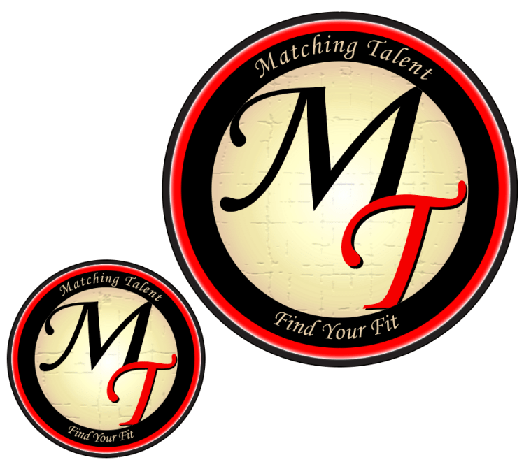
The Adobe program I chose to revisit is Adobe Illustrator, where we constructed our logos for this course.
Why Illustrator?
I selected this program for a few reasons. I have found it the most useful in day-to-day work since we completed the tutorials. I actually used Illustrator to create some graphics for another class project, as well as some projects I have done for work in the last few months. The other reason I selected this project is because the logo project, although it created a lot of frustration at the time of creation, actually ended up being one of my favorite projects. It is so fun to get lost in the design opportunities of Illustrator!
Original Logo
Reflecting on the projects we completed this term, I decided I wanted to fine tune this Matching Talent Logo. I looked through each project we had completed, and immediately identified some areas of improvement on this logo.
Although I may never use this logo in the professional world, I do have a personal and professional relationship to the subject that the logo represents. I have spent a lot of time recruiting for companies, advising on techniques to identify good candidate-culture fits, and experimenting with the best ways to showcase a company’s attributes.
Edits
The first thing I changed about this logo was the white drop shadow on the “MT.” After spending some time away from the logo I realized I did not like the effect this gave. Next, I changed the opacity of the black circle to 100% so that it would be more sharp and would blend better with the black “M.” I also changed the opacity of the outer most circle to 95% to make it more pronounced.
The gradient on the cream circle was altered slightly. I experimented with various 3D effects on the cream circle, but decided to use the Craquelure texture instead. The innermost circle now has a Craqueler texture (crack spacing- 65, crack depth- 3 and crack brightness- 9). This texture made the edges of the circle very weathered, so when I used the clipping mask this time I made sure to clip off the edges of the circle so that it would look crisp against the black circle.
While making these edits I experimented with a few different versions before settling on a revised logo for submission.
The text was also changed. The “MT” in the innermost circle has a fisheye effect to accentuate the spherical perception. The phrases “Matching Talent” and “Find Your Fit” were moved, the arch was altered, and the text color changed to the same cream color of the inner circle.
Potential Applications
If I were to ever use this logo in a professional environment, it would likely be for my own recruiting firm. I could also see the logo being used to represent a Human Resources discussion board.
Revised Logo
I feel that this version is an improvement from the previous logo in that it is more engaging to the viewer. I also prefer the text coloring and placement in this logo. It was really nice to have an opportunity to revisit the work from this course and revise this project.
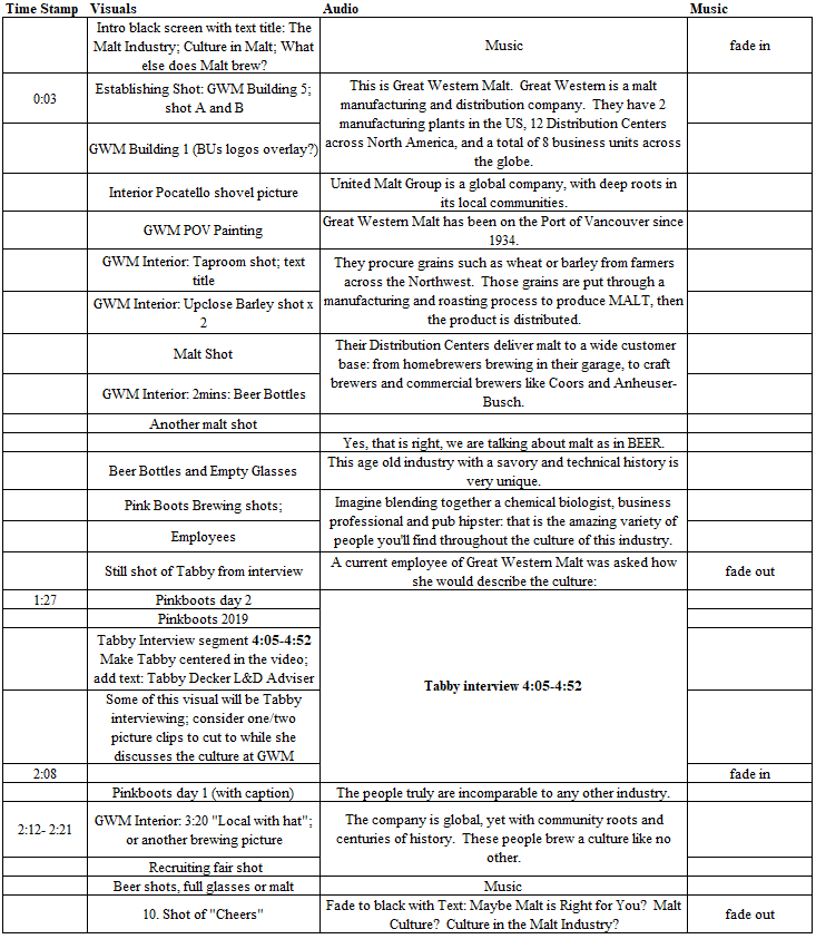
For my Video Story I chose to create a narrative story segment that includes a section of an interview. This video focuses on the culture within the Malt Industry and explores the passionate people who create it.
Check out my video below. Clickhere if the embedded video is not working.
This video briefly explores the culture of people brewing in the malt industry.
Inspiration
After interviewing a coworker for our audio project, some of her answers gave me inspiration for this project. I knew I wanted to incorporate a section of her interview, and I also wanted to briefly discuss the company industry and its quirky people.
To accomplish the heartfelt yet fun vision I intended, I planned to include pictures and video of the company’s exterior, clips of the interior that speak to its history along with people in the industry and various video of the product.
Filming Process
To the field! Not the barely fields unfortunately…
On a couple trips into work I took video of the exterior of the plant and General Offices. I also took video inside one of the older buildings. One of the office buildings was originally a Taproom, from when employees were allowed to drink on premises. In the Taproom, there are old paintings and other memorabilia, along with a collection of beer bottles. This film session makes up most of the building and interior shots included in this video.
The video of malt and beer was taken in my backyard with the assistance of my boyfriend. Once we had a sunny day, I collected some recruiting equipment (GWM table cloth and malt samples), a construction stool, beer and two glasses.
The glasses are actually from an Oregon Brewfest from years ago. Great Western Malt and Country Malt Group often sponsor local brewfests, so their logos are on the glasses used in these shots, which I thought was a nice touch.
Our brewfest enthusiasm paid off!
By the end of all these sessions I probably had at least fifteen to twenty minutes of video.
Gathering Other Materials
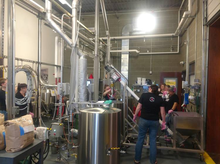
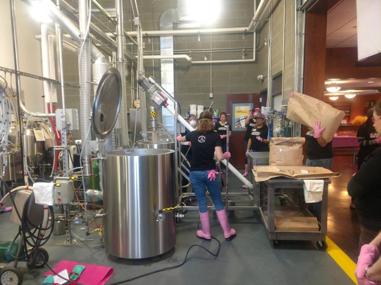
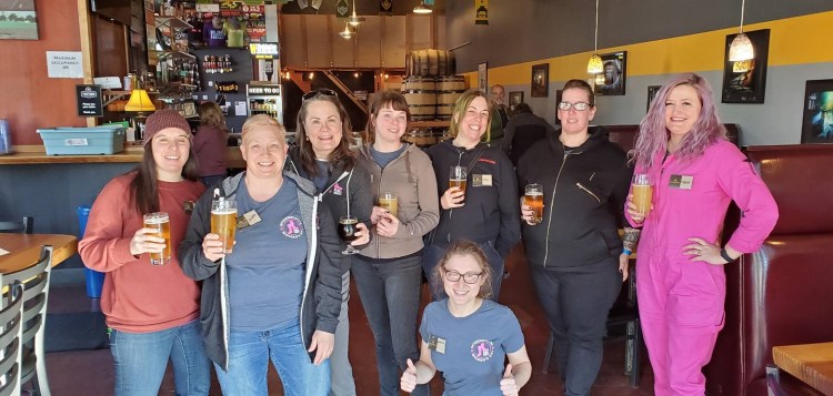
Before beginning the editing process, I also sifted through photos that I thought I could incorporate. Some of the photos used in this video were actually taken as we were working on our Graphic Design Project. I also found pictures I had taken last year at the Pink Boots Brew Day.
Pink Boots Day 2019 in the Malt Innovation Center
Pink Boots Day 2019 in the Malt Innovation Center
These pictures were taken from the 2019 Pink Boots Brew Day. The Malt Innovation Center is located near our General Offices and Manufacturing Plant on the Port of Vancouver.
Pink Boots Society If you don’t know… Pink Boots is a society founded by an employee of Great Western Malt to promote the community of women working in the beer industry. Every year, near International Women’s Day, Pink Boots Society members across the world gather together with local women in the industry to brew together and share their industry knowledge. It is probably one of the most fun work days.
One picture was used from this year’s Pink Boots Brew Day that was not taken by me. This picture was taken by a Pink Boots Day participant and was shared with my company for use.
Audio
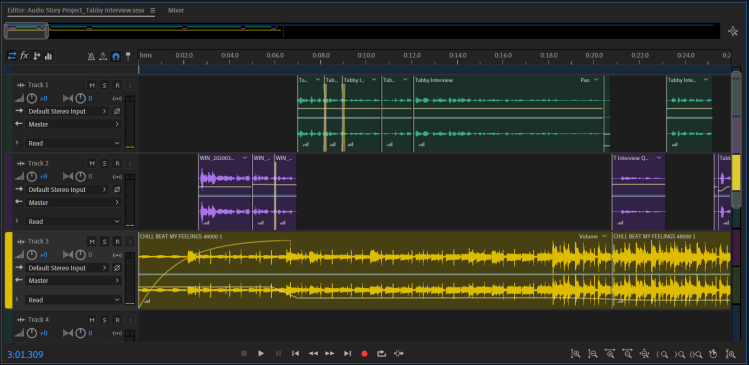
Once I had gathered most of the video material I intended to use, I started working on the audio. First, I decided what section of interview I wanted to use from the interview conducted with Tabby Decker. Once I knew what section of her interview I wanted to focus on, I drafted up the narration to surround it.
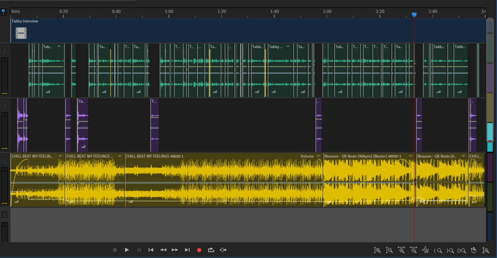
To the left you can see the audio and video from the interview being combined with the narration. Here I also marked the sections of the interview I intended to use for the video.
Narration
I recorded myself using a recording app on my cellphone somewhere between five and ten times. Each time I recorded the narration with slightly different fluctuations of my voice.
In at least 50% of my recordings you can hear my dog’s collar jingling in the background, or them commencing a howling match… so those recordings were automatically out.
Combining Audio
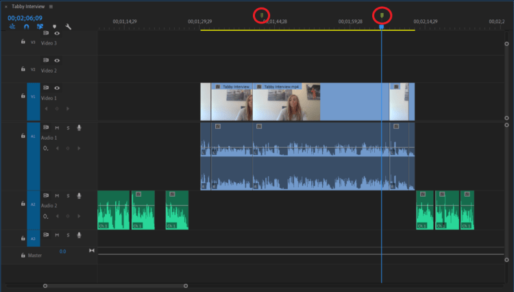
I imported the interview with Tabby and the narration I recorded into Premiere. Using the markers and the mark in/mark out tool I selected the section of Tabby’s interview I intended to use. While editing the narration audio to align well with Tabby’s interview, I edited out sections of audio using the razor tool and marked which sections of Tabby’s interview would include video of her speaking.
The volume of Tabby’s interview was increased to 6.05dB. The volume of the narration is -0.00dB.
Music
The music selected is Paradise by Ikson, found on Sound Cloud. I reached out to @Ikson for permission to use this track in this project. The music fades in and out using a Constant Power fade. The music is at -18dB during the introduction and when the credits roll. Throughout the rest of the interview the music volume is -48dB, the volume was lowered from my initial draft after obtaining peer feedback.
Editing Process
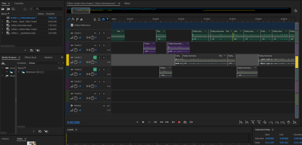
Once all the audio was aligned roughly the way I wanted it, I began organizing the video.
Storyboard
To begin compiling the video, I first developed a storyboard. The storyboard was a great tool to organize my ideas, even though I ended up straying from it. Here you can see what my initial storyboard looked like.
I first selected which building shots I wanted to use as my establishing shot. I then identified areas of the audio I wanted to be associated with pictures of people versus pictures of malt or beer.
I added a section for the introduction title and ending credits, although the title was still in the works at this time.
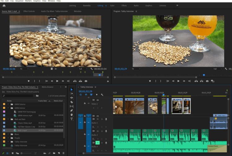
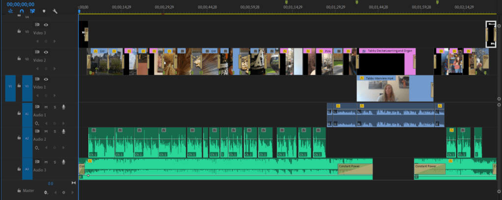
Video Splicing
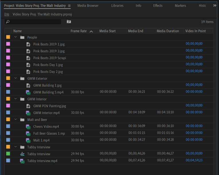
Next I imported all of the video and picture files I intended to use in the sequence. Before adding any videos to the sequence, I organized all videos and pictures into bins and named them.
After submitting the draft version of this video, I made one major change to the video sequence: during the introduction I replaced a shovel picture, with this building picture that also includes the United Malt Group logo. This better aligns with the narration. This photo was edited in Adobe Photoshop, saved as a .Jpeg file, then imported into Premiere.
I went through each video and selected 5-10 seconds. Using the mark in/mark out tools. I added these sections to the video sequence along with the pictures I selected.
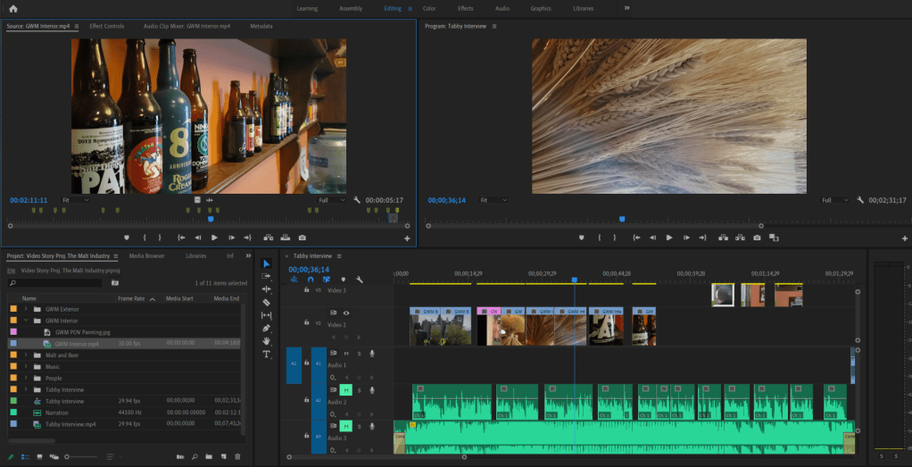
Here are two examples of using the mark in/mark out tool to select video prior to moving it to the sequence.
Once the videos and pictures were all placed in the sequence, I used the razor tool, slip tool and ripple edittool to adjust the lengths of the videos. This step took awhile. I wanted each shot to be roughly the same length and to correspond with certain pieces of the audio. During this stage I also changed the order of some of the sequence.
Effects
Once the sequence had the narration, interview, music, videos and pictures aligned and the lengths edited, I added the introduction, ending, and text. Then I started playing with various effects.
Introduction and Ending
For the introduction I added the text Brewing Culture in the Malt Industry. I selected the color, stroke and shadow by using GWM branding hex codes. This title enters with a cross zoom effect. The background is a video of malt with the scale and position altered. The video and text cross dissolve to the beginning of the first establishing shot.
The last video clip fades out with a dip to black effect at which time the credits scroll. A peer’s feedback gave the idea of scrolling credits, as well as adding Tabby Decker to the credits. I followed this tutorial to create this effect.
Interview Effects
A cross dissolve transition is used at the beginning and end of the video of Tabby. The cross dissolve transition is also used on the entrance and exit of the text of her name and title. This text intentionally dissolves out right before the music picks up again and the interview segment is about to end. This text follows the Lower Third technique.
The scale, position and rotation of this video clip was also edited to better follow the Talking Head technique.
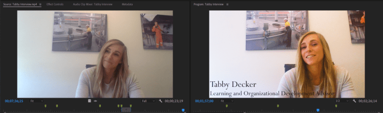
After receiving some peer feedback, I followed this instructional video to improve the video quality of Tabby’s interview by adding an adjustment layer. Below you can see the difference adding the adjustment layer made to the video.
The photo to the left is before the adjustment layer was added.
Adjustment layers were also used on the still shot of Tabby at 1:15, along with the first two establishing shots of the Great Western Malt building. (Thank you @joannaobayer for the awesome tutorial suggestion!)
Scaling and Position
There were several clips that were adjusted by changing the scale and position, or by rotating them to be more level. Every picture that was used had to be adjusted to better fill the frame. I also considered the Rule of Thirds as these adjustments were made. Additional adjustments to both the scaling and position of clips were made after the draft submission.
More Transitions
Next, I spent some time playing with video transitions. After the video transitions were added, I also adjusted the length of some of the transitions (making the transitions longer or shorter) depending on the two clips.
The video transitions used throughout this story are:
Dip to Black
Cross Dissolve
VR Light Rays
Iris Box
Additive Dissolve
VR Iris Wipe
VR Spherical Bluer
Film Dissolve
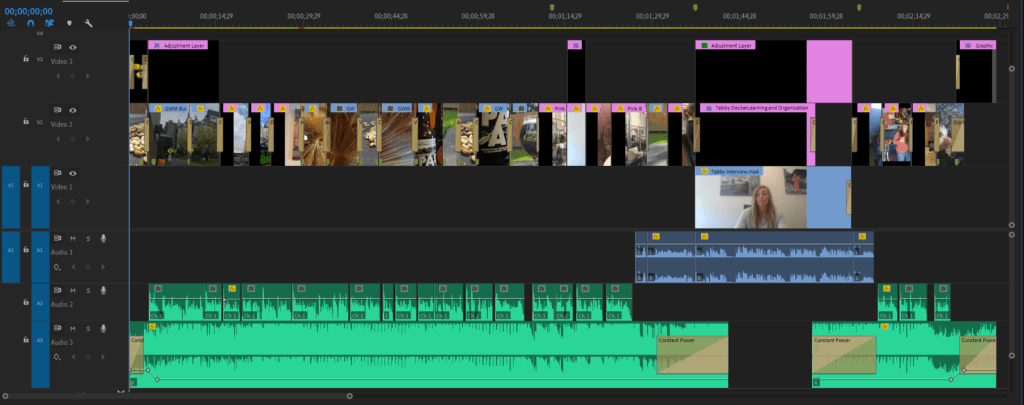
This is what the sequence looked like after all the effects were added:
This is what my edited sequence looks like.
That’s a Wrap
I hope you enjoyed this video Brewing Culture in the Malt Industry.
For my Video Story I chose to create a narrative story segment that includes a section of an interview. This video focuses on the culture within the Malt Industry and explores the passionate people who create it.
Check out my draft below. Clickhereif the embedded video is not working. I look forward to your feedback!
Inspiration
After interviewing a coworker for our audio project, some her answers gave me inspiration for this project. I knew I wanted to incorporate a section of her interview, and I also wanted to briefly discuss the company industry and its quirky people.
To accomplish the heartfelt yet fun vision I intended, I planned to include pictures and video of the company’s exterior, clips of the interior that speak to its history along with people in the industry and various video of the product.
Filming Process
To the field! Not the barely fields unfortunately…
On a couple trips into work I took video of the exterior of the plant and General Offices. I also took video inside one of the older buildings. One of the office buildings was originally a Taproom, from when employees were allowed to drink on premises. In the Taproom, there are old paintings and other memorabilia, along with a collection of beer bottles. This film session makes up most of the building and interior shots included in this video.
The video of malt and beer was taken in my backyard with the assistance of my boyfriend. Once we had a sunny day, I collected some recruiting equipment (GWM table cloth and malt samples), a construction stool, beer and two glasses.
The glasses are actually from an Oregon Brewfest from years ago. Great Western Malt and Country Malt Group often sponsor local brewfests, so their logos are on the glasses used in these shots, which I thought was a nice touch.
Our brewfest enthusiasm paid off!
By the end of all these sessions I probably had at least fifteen to twenty minutes of video.
Gathering Other Materials
Before beginning the editing process, I also sifted through photos that I thought I could incorporate. Some of the photos used in this video were actually taken as we were working on our Graphic Design Project. I also found pictures I had taken last year at the Pink Boots Brew Day.
Malt Innovation Center- Vancouver, WA
Malt Innovation Center- Vancouver, WA
These photos are from the Pink Boots Brew Day 2019. Location: Great Western Malt Lab
Pink Boots Society If you don’t know… Pink Boots is a society founded by an employee of Great Western Malt to promote the community of women working in the beer industry. Every year, near International Women’s Day, Pink Boots Society members across the world gather together with local women in the industry to brew together and share their industry knowledge. It is probably one of the most fun work days.
One picture was used from this year’s Pink Boots Brew Day that was not taken by me. This picture was taken by a Pink Boots Day participant and was shared with my company for use.
Audio
Once I had gathered most of the video material I intended to use, I started working on the audio. First, I decided what section of interview I wanted to use from the interview conducted with Tabby Decker. Once I knew what section of her interview I wanted to focus on, I drafted up the narration to surround it.
To the left you can see the audio and video from the interview being combined with the narration. Here I also marked the sections of the interview I intended to use for the video.
Narration
I recorded myself using a recording app on my cellphone somewhere between five and ten times. Each time I recorded the narration with slightly different fluctuations of my voice.
These trouble makers make it hard to record audio sometimes!
In at least 50% of my recordings you can hear my dog’s collar jingling in the background, or them commencing a howling match… so those recordings were automatically out.
Combining Audio
I imported the interview with Tabby and the narration I recorded into Premiere. Using the markers and the mark in/mark out tool I selected the section of Tabby’s interview I intended to use. While editing the narration audio to align well with Tabby’s interview, I edited out sections of audio using the razor tool and marked which sections of Tabby’s interview would include video of her speaking.
The volume of Tabby’s interview was increased to 6.05dB. The volume of the narration is -0.00dB.
Music
The music selected is Paradise by Ikson, found on Sound Cloud. I reached out to @Ikson for permission to use this track in this project. The music fades in and out using a Constant Power fade. Throughout the interview the music volume is -32dB.
Editing Process
Once all the audio was aligned roughly the way I wanted it, I began organizing the video.
Storyboard
To begin compiling the video, I first developed a storyboard. The storyboard was a great tool to organize my ideas, even though I ended up straying from it. Here you can see what my initial storyboard looked like.
I first selected which building shots I wanted to use as my establishing shot. I then identified areas of the audio I wanted to be associated with pictures of people versus pictures of malt or beer.
I added a section for the introduction title and ending credits, although the title was still in the works at this time.
Video Splicing
Bin Organization
Next I imported all of the video and picture files I intended to use in the sequence. Before adding any videos to the sequence, I organized all videos and pictures into bins and named them.
I went through each video and selected 5-10 seconds. Using the mark in/mark out tools. I added these sections to the video sequence along with the pictures I selected.
Here are two examples of using the mark in/mark out tool to select video prior to moving it to the sequence.
Once the videos and pictures were all placed in the sequence, I used the razor tool, slip tool and ripple edittool to adjust the lengths of the videos. This step took awhile. I wanted each shot to be roughly the same length and to correspond with certain pieces of the audio. During this stage I also changed the order of some of the sequence.
Effects
Once the sequence had the narration, interview, music, videos and pictures aligned and the lengths edited, I added the introduction, ending, and text. Then I started playing with various effects.
Introduction and Ending
For the introduction I added the text Brewing Culture in the Malt Industry. I gave this a cross dissolve effect as it fades into the dip to black at the beginning of the first establishing shot.
At the end of the video I added credit text after the last video dips to black. This text fades in and out with a cross dissolve effect.
Interview Effects
A cross dissolve transition is used at the beginning and end of the video of Tabby. The cross dissolve transition is also used on the entrance and exit of the text of her name and title. This text intentionally dissolves out right before the music picks up again and the interview segment is about to end. This text follows the Lower Third technique.
The scale, position and rotation of this video clip was also edited to better follow the Talking Head technique.
Scaling and Position
There were several clips that were adjusted by changing the scale and position, or by rotating them to be more level. Every picture that was used had to be adjusted to better fill the frame. I also considered the Rule of Thirds as these adjustments were made.
More Transitions
Next, I spent some time playing with video transitions. After the video transitions were added, I also adjusted the length of some of the transitions (making the transitions longer or shorter) depending on the two clips.
The video transitions used throughout this draft are:
Dip to Black
Cross Dissolve
VR Light Rays
Iris Box
Additive Dissolve
VR Iris Wipe
VR Spherical Bluer
Film Dissolve
This is what the sequence looked like after all the effects were added:
Using the video and audio hierarchy is definitely a great approach to keep organized!
That’s a Wrap
I look forward to your feedback on this draft! Cheers!
Below are the videos and links to my completed Premiere Tutorials for COM 561.
Tutorial 1
Tutorial 1: Raw Footage
Below is the raw footage taken for Tutorial 1. This footage was taken in the corner of our living room. If the video is not working, try clicking here.
This is the raw footage for Tutorial 1.
Tutorial 1: The Living Room Corner
Below is the edited video for Tutorial 1. I’ll definitely be working on stabilizing my shots for the final video project! If the video does not work, try clicking here.
This is my finished product for Tutorial 1.
Tutorial 2
Tutorial 2: Murrow Hall
Below is my finished product for Tutorial 2. If the video is not working, try clicking here.
For my audio story, I chose to conduct an interview. The purpose of this interview was to obtain market research in relation to what candidates look for in a prospective company. I “went to the field” in a matter of speaking. A coworker of mine was gracious enough to let me bombard her with questions. Below you can listen to the actualities, narration and music that make up my Final Audio Story.
If the embedded audio below is not working, click here.
Rachelle Berrigan, HR Specialist, interviewing Tabby Decker, Learning and Development Adviser, about working in the malt industry.
Inspiration
Working in Human Resources, everyday discussions include benefits, employee satisfaction, retention, culture, compensation, etc. The intent of Matching Talent is to provide an opportunity to explore these topics through getting in the minds of candidates or employees who perhaps don’t discuss these topics on a daily basis because it is part of their job.
Human Resources is always trying to find the right way to engage current and future employees. However, sometimes I wonder if what our employees really want gets lost in all of the data, policies and initiatives.
This is why I chose to conduct an interview for my Audio Story. I wanted an opportunity to hear from an employee what is important to them. Another reason why I chose an interview for my Audio Story is because I knew I could use some of this material for our next project, the Video Story.
Research and Raw Materials
I started gathering raw materials when we were working on our Audition Tutorials. The first person I interviewed was my boyfriend who is currently a full time student. After splicing down this interview for our Audition Tutorial, I realized I was definitely going to need additional material for this Project.
The Interview
In preparation for the interview, I wrote down questions that would guide the interviewee to share their perspectives. I also reached out to a coworker to schedule time for us to meet. Although I was ultimately going to need 3 minutes of audio, I made sure we had at least 30 minutes to accommodate for the set up and take down, along with a 10-15 minutes interview.
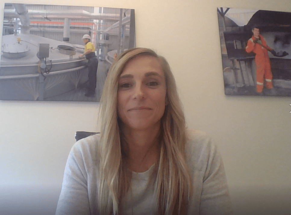
This is the lovely and most helpful Tabby Decker, who was gracious enough to let me interview her.
Just finding a conference room to conduct the interview was challenging. We work in manufacturing, so in most of our conference rooms you can hear a light rumbling from the plant. Once we found a conference room that worked, I tried to decompress the interview stress before starting the recording.
In order to get the camera angle I wanted of the interviewee, I had to be in a position where my laptop microphone could not hear me very well. This resulted in me having to make separate recordings of myself asking the questions. This challenge resulted in some additional time editing, but also gave me flexibility to rearrange the narration of my questions.
Music
Selecting music to pair with this interview was not easy. There are so many options out there and each will communicate a different feel to the listener. I ended up selecting two clips of music I found on SoundCloud that are legal to use under Creative Commons.
The entire raw interview was 7:39 in length. I listened to this several times to select the actualities of the interview I wanted to use in this Audio Story. I used the razor tool to cut the material down to about three minutes. Next, I recorded the voice-over of myself asking questions that paired best with the interview responses I intended to use. I saved each of these files with appropriate titles to easily differentiate them in Audition.
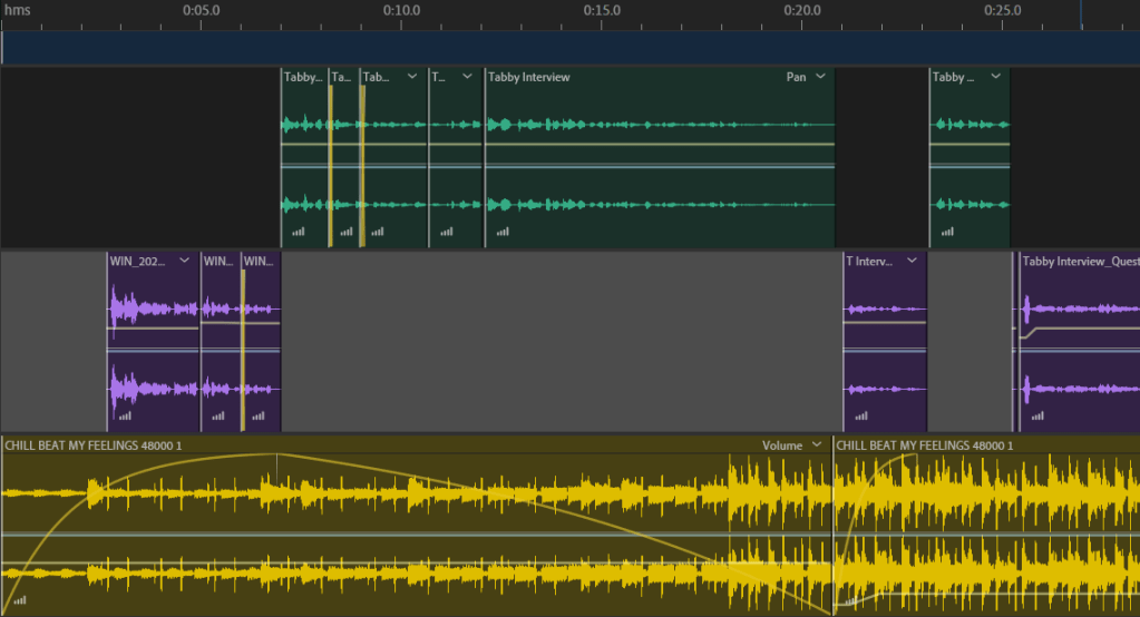
Using Multitrack, I dragged each of these recordings to the “Files” section of Audition. I went through both of these audio tracks A LOT of times. I used the razor tool to edit out unnecessary “ums” along with other redundant words or sounds that did not add value to the audio.
After editing the track of Tabby and the track of myself talking individually, I aligned the two audio tracks so that the conversation flowed without significant pauses. At this stage I listened to the audio a few more times and made a few more edits with the razor tool. I increased or decreased the volume in attempts to compensate for pitch fluctuation. I also overlapped some pieces of audio as you can see in the screen shot below.
This is a capture of when I was editing the interview audio, before I added the music tracks.
Music Tracks
Next I added the first music track, Feelings. The Feelings audio track makes up the first minute and 58 seconds and the last 6 seconds of the music used. For the rest of the interview I used a section of the music track, Blossom.
Maintaining a timeline hierarchy was very beneficial during this stage.
In the introduction, the music fades in at a value of 40 at -14.8 dB as I introduce myself. When Tabby introduces herself the fade peaks and the volume decreases to -30 dB over the course of 1 second. After Tabby introduces herself, the volume decreases slightly to -36.5 dB, at which it remains until the exit of the interview. I wanted the music to continue throughout the interview, but at a lower volume. In my draft the volume was -33 dB, and I had made the music introduction very complicated. Some feedback suggested that the decibel of the music was distracting, so this has been simplified in the final version. The music volume is -36.5 dB for the majority of the interview.
Introduction in the Final Audio Story
Introduction in the Draft Audio Story
Here you can see the difference between the introduction in the Final Audio Story versus the Draft Audio Story.
From 1:56 to 1:59 the music fades out at a value of 71 when I ask “How would you describe the culture here?” This is when Tabby says “passion describes our culture.” I wanted to bring focus to this section. During Tabby’s description of the passionate people in the malt industry, the music changes to the Blossom track and fades in slowly at a value of 0. At this value the music gets louder the more passionate she gets in speaking about the people.
At 2:28, the music begins to fades out at a value of 43 before I ask my last question, “What is your favorite part about the company?” Here the music begins to fade back in at value of -5 with an intentional pause where the volume decreases to -53.3 db for almost 2 seconds as Tabby says, “The people.” The fade climaxes and the volume returns to the standard -36.5 dB.
This picture shows the edits made during the segment in which Tabby is talking about “The people.”
At 2:34 a different section of the audio track Blossom fades in at a value of -5 before it fades out at a value of 24.
After Tabby answers the last question, at 2:54, the music cuts back to Feelings and fades in quickly at a value of 84, then fades out at a value of 13.
This capture shows all of the Multitracks in Audition for the 3-minute Industry Interview.
Overview
This was a nice opportunity to hear from an employee’s perspective, what sets malt apart from other industries.
For my audio story, I chose to conduct an interview. The purpose of this interview is to obtain market research in relation to what candidates look for in a prospective company. I “went to the field” in a matter of speaking. A coworker of mine was gracious enough to let me bombard her with questions. Below you can listen to the draft of the interview conducted.
If the embedded audio below is not working, click here.
Rachelle Berrigan, HR Specialist, interviewing Tabby Decker, Learning and Development Advisor.
Inspiration
Working in Human Resources, everyday discussions include benefits, employee satisfaction, retention, culture, compensation, ect. The intent of exploring Matching Talent through this blog was to provide an opportunity to get in the minds of candidates or employees who perhaps don’t discuss these topics on a daily basis because it is part of their job.
Human Resources is always trying to find the right way to engage current and future employees. However, sometimes I wonder if what our employees really want gets lost in all of the data, policies and initiatives.
This is why I chose to conduct an interview for my Audio Story. I wanted an opportunity to hear from an employee what is important to them. Another reason why I chose an interview for my Audio Story is because I knew I could use some of this material for our next project, the Video Story.
Research and Raw Materials
I started gathering raw materials when we were working on our Audition Tutorials. The first person I interviewed was my boyfriend who is currently a full time student. His interview gave me great material for our second Audition Tutorial and was a nice trial run. After splicing down the first interview for our Audition Tutorial, I realized I was definitely going to need additional material for this Project.
The Interview
I spent some time writing down questions that would be beneficial to reference during the interview, and I reached out to a coworker to schedule some time for us to meet. Although I was ultimately going to need three minutes of audio, I made sure we had at least 30 minutes to accommodate for the set up/take down along with a 10-15 minute interview.
This is the lovely and most helpful Tabby Decker, who was gracious enough to let me interview her.
Just finding a conference room to conduct the interview was challenging. We work in manufacturing, so in most of our conference rooms you can hear a light rumbling from the plant. Once we found a conference room that worked, I tried to decompress the interview stress before starting the recording.
In order to get the camera angle I wanted of the interviewee, I had to be in a position where my laptop microphone could not hear me very well. This resulted in me having to make separate recordings of myself asking the questions. This challenge resulted in some additional time editing, but also gave me flexibility to rearrange how I asked certain questions.
Sound Bites
Selecting music to pair with this interview was not easy. There are so many options out there and each will communicate a different feel to the listener. I ended up selecting two clips of music I found on SoundCloud that are legal to use under Creative Commons.
Once I had my initial interview recording, I listened to it several times to select the portions of the interview I wanted to use in this Audio Story. I used the razor tool to cut the material down to about three minutes. Next, I re-recorded myself asking questions that paired best with the interview responses I wanted to use. I saved each of these files with appropriate titles to easily differentiate them in Audition.
Using Multitrack, I dragged each of these recordings to the “Files” section of Audition. I went through both of these audio tracksA LOT of times. I used the razor tool to edit out unnecessary “ums” along with other words or sounds that did not add value to the audio.
After editing the track of Tabby and the track of myself talking individually, I aligned the two audio tracks so that the conversation flowed without significant pauses. At this stage I listened to the audio a few more times and made a few more edits with the razor tool. I also overlapped some pieces of audio as you can see in the screen shot below.
This is a capture of when I was editing the interview audio, before I added the music tracks.
The Music Tracks
Next, I added the first music track, Feelings. The Feelings audio track makes up the first 44 seconds and the last 5 seconds of the music used. For the rest of the interview I used the music track, Blossom.
Here you can see what the introduction looks like in Audition.
In the introduction, the music fades in at a value of 40 for the first 6 seconds. When Tabby introduces herself the fade peaks, then fades out at a value of 13. I wanted the music to continue throughout the interview, but at a lower volume. To do this I used the razor tool to create 3 sections of this portion of the audio track. When the music fades out, it fades into a lower volume of the same track, at -33.3 dB.
The music maintains this volume until 1:55, at which time it fades out at a value of 71 when I ask “How would you describe the culture here?” This is when Tabby says “passion describes our culture.” I wanted to bring focus to this. During this section of Tabby talking about the passionate people in the industry, the music changes to the Blossom track and fades in at a value of -32. At this value the music gets louder the more passionate she gets in speaking about the people.
At 2:28, the music begins to fades out at a value of 43 before I ask my last question, “What is your favorite part about the company?” There is an intentional pause here before Tabby says, “The people,” and the fade in climaxes.
At 2:34 a different section of the audio track Blossom fades in at a value of -16 before it slowly fades out at a value of -35. The loudest point here is right after Tabby says “the people,” to give emphasis.
After Tabby answers the last question, at 2:53, the music cuts back to Feelings and fades in quickly at a value of 56, then fades out at a value of 13.
This is what the Multi-track currently looks like in Audition.
Takeaways
I learned a few things through this process that will definitely be good takeaways for next time… 1. Schedule more time than you need. 2. Gather more material than you need, because you’ll probably only like half of it. 3. Find a quiet place to record; doing a test record is definitely a good idea (the heaters in my house are very loud, apparently. I didn’t realize how loud until I heard them on my playback.). 4. Find a way to put who you are talking with at ease. 5. Conduct all recordings in the same environment if possible. 6. Just like some of our readings have said, you’re going to think it sounds awful, but just keep practicing.
Looking Forward to Your Feedback
I am not sure if all of the fading in and out with the music created a distraction or added feeling/emphasis to the interview. I’m also not sure if overall the music is too loud or not. I look forward to your feedback.
Through exploring recruiting and Human Resources material over the last few weeks, as it specifically relates to this blog, I wanted to use the ideogram of puzzle pieces. The Draft Logo I initially submitted, which embodies this idea, is below.
I spent hours and hours trying to make this design idea work… sometimes you just need to know when to give up and change directions. Unfortunately giving up is not my forte. So, I spent a lot of time “beating a dead horse” trying to make this one idea work. I also received some helpful feedback from peers regarding this first logo, but it never seemed to look right. Eventually I disliked this version enough I accepted different inspiration.
Research and Redesign
One of the videos we watched in Unit 2 was useful in reinforcing I needed to go a different direction with my logo. After watching Aaron Draplin Takes On a Logo Design Challenge, it solidified that sometimes simple is better. Simple designs can be more universally applied to gear or backdrops.
When I was first contemplating my design, I found myself leaning towards very innate or busy concepts. In my initial design, I tried to stray away from this, but still found myself dissatisfied with the result. Despite my efforts, the logo never felt balanced. Eventually, I had inspiration for something more classic and simple.
Technical Process
The Circles
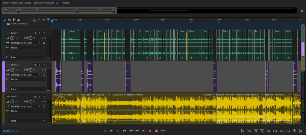
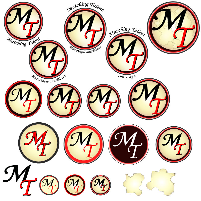
To create my final design, I started with four circles of varying sizes. To the right you can see these circles individually with the color, gradient, opacity and overall appearance chosen for each individual circle listed beneath it. I chose two layers of the cream/brown to create additional depth in the focal point of the design. I selected the colors black, creams and browns as they are neutral and calming colors. I added red because it is a vibrant and complimentary color.
Once the circles were the size, color, gradient and opacity desired, I selected all of them and used the align center tool. The bottom right of the image to the right shows the circles aligned.
The Typography
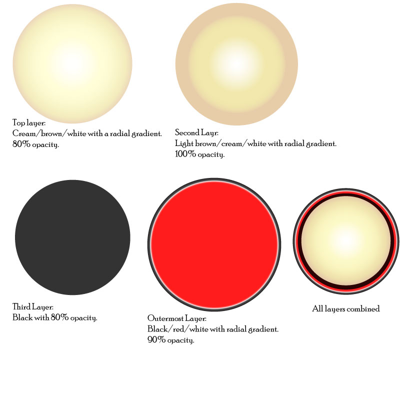
The typography is Monotype Corsiva, which I feel is elegant and professional. To create depth for the “M” and “T,” I used a similar technique as to what we used in the “To-Do Tutorial” to create the check mark and notepad. The first layer of “MT” is all black with a 2pt stroke. For the second layer, the “M” is black and the “T” is red. I aligned these slightly off set to create the black shadow under the “T.” Once the “MT” was aligned and proportioned how desired, I added an outer glow of white at 40% opacity and 9px blurred.
Bringing It Together
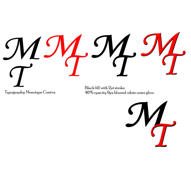
With the circles and typography created, next I used the clipping mask. I separated the bottom circle layers (the black layer and red layer), and copied the black layer. The black, cream/white, and cream/brown circles were then aligned with the grouped text. I used the black circle during this stage so I could more easily see what the finished product would look like. Once the text was positioned well, I copied the bottom cream/brown circle, pasted in place and then used the clipping mask. This removed the excess pieces of the letters so they fit better in the circle.
When all circles were recombined and aligned center, the black in the “M” blends into the black circle, utilizing the continuation principle.
Once all of these elements were placed, I grouped them together. Next, I experimented with different variations of words associated to the blog arced at a 45-degree (and –45-degree) angle around the logo. Variations included: “Matching Talent,” “Find Your Fit,” and “Pair People and Places.” This text is also Monotype Corsiva. I selected all groups and used the align center tool to ensure correct placement.
Below you can see several variations of this design:
Before I settled on my final variation of my second logo revision, I experimented with several modifications. Above is a collection of those modifications/drafts.
For my final design logo it was challenging to decide between the logo with or without the surrounding words. Depending on branding usage, the words may or may not be included… Eventually I selected the logo with the phrases surrounding the outermost circle, as pictured to the left.
Design Significance
This design ended in a much different place than I had originally anticipated. However, I’m satisfied with the direction it took. The shapes are crisp and simple with pleasing color contrast. The colors are neutral and inviting. To me, there is a 50’s feel to the logo which communicates a level of old-fashioned trust to the audience. Overall, this logo is much more professional and versatile than my initial draft.
Here is my Logo Draft for the blog Matching Talent.
The Research Stage
Through exploring recruiting and Human Resources material over the last few weeks, as it specifically relates to this blog, I chose to use the ideogram of puzzle pieces. In the past I have seen some recruiting memes and articles use puzzle pieces to reference recruiting efforts and found it effective.
An example of this can be found here. The article Manufacturing Companies and HR Tech has a picture that somewhat embodies my thought process behind incorporating the puzzle pieces into my design. This article also discusses exactly what my blog is targeted to discuss: how the HR profession needs to grow along with the technology age.
One of the videos we watched recently was also useful in my research process. When I was first contemplating my design, I found myself leaning towards very innate or busy concepts. After watching Aaron Draplin Takes On a Logo Design Challenge, it reinforced that sometimes simple is better; simple can be more universally applied to gear or backdrops.
Design Process
The design process for my Logo Draft was certainly iterative. It included a lot of: draw, manipulate, apply in Illustrator, manipulate, evaluate, walk away, reevaluate… REPEAT.
Before beginning in Illustrator, I sketched various ideas. I knew I wanted the logo to have the words “Matching Talent,” with focus on the “M” and “T”, and I knew I wanted to incorporate an ideogram that would support the topic. To the left you can see some of my initial sketches.
Below you see my Logo Draft at several different stages of development. After a lot of time spent manipulating shapes, letters and colors, I am still not satisfied with the result, but I suppose that is why it is called a draft. I am looking forward to the next step of the user-centered design process and obtaining some feedback that I can hopefully incorporate into my Final Logo.
Stage 2
Stage 3
Stage 4
Technical Process
Puzzle Pieces
To create the Logo Draft, I started by creating the puzzle pieces. I used the rectangle tool to create the basic shape, then I used the ellipse tool to create a circle. Once I had both of these base shapes to a size I liked, I duplicated them several times. This provided me plenty of material to experiment with developing puzzle pieces. (See Stage 2 photo)
The shape builder tool ended up being my most used tool for this logo, which is entertaining considering the shape builder tool also gave me the (second) most trouble in the Illustrator Tutorials. Now I am very familiar with it!
To form puzzle pieces, I aligned several rectangles and centered the circles over where the rectangles intersected in an inconsistent, but calculated, way. Then I selected the shapes and used the shape builder tool to merge certain circles with certain rectangles. Keeping the rectangles aligned, this also subtracted half circles from some rectangles, which assisted in creating the variance in shapes.
For these puzzle pieces I used a linear gradient of yellows, oranges, and white. The puzzle pieces have a 0.75 black stroke and are set to an opacity of 100%.
Once the basic puzzle piece was created, I copied the piece, made it a darker orange color with 80% opacity and slightly misaligned it under the original puzzle piece. I then used the shape builder tool to delete excess pieces and merge others to create the 3-D look to the puzzle piece.
The puzzle pieces have been arranged ascending and rotating from the “i” in “Matching,” wrapping the “T” to the “M” in the logo.
Text
Next, I created the letters. I used the rectangle tool to create the “M” and the “T.” In the “Stage 2” photo referenced earlier, you can see the initial rectangle that was used. I copied this rectangle several times and then aligned the rectangles to resemble the shape of an “M” and a “T.” Once aligned, I used the shape builder tool. When completed, I grouped the “M” and the “T” shapes.
I also used the shape builder tool to merge the “M” and “T” into one shape. These adjoined letters use the Gasalt Principle of continuation. For these letters I used a radial gradient of black and red with a –25-degree angle. This, along with some other manipulation, created the black “circular swoosh” through the red letters. The “M” and “T” have a 2pt stroke with a drop shadow of multiply (at 75% opacity, -2 Xoffset and +2 Y offset with 0 blur). The drafts shown in the “Stage 3” photo have a black drop shadow, but I also experimented with blues and greens for this.
For the text “atching” and “alent” I used Monotype Corsiva font. Simple seemed best for this text.
Design Significance
I wanted to focus on the initials “MT” since this is the title of the blog and represents significance to the recruiting topic. I considered omitting the entire words “Matching Talent,” however, an afterthought was that “MT” also is an abbreviation for the state Montana, so it seemed best to us the entire words.
Red is known as an empowering color. I chose this as the predominant color intentionally, as to, hopefully, empower people to find the right fit. Yellow is a complementary color to red and also joyful, which I feel brightens the logo a bit.
I decided to incorporate puzzle pieces into the design because they are a simple touch that help to further convey the idea of matching or pairing.
Second Draft
The day after we submitted our drafts, I finally got some different inspiration. To the left is another logo draft I started working on. I won’t go into technical details at this time, but I like it because it is much more simple than my other draft with the puzzle pieces. I’m looking forward to hearing your thoughts.
Below are my finished products from the Illustrator Tutorials for COM561. These tutorials were very informative, sometimes frustrating, and time consuming! However, I think the exercises did a good job preparing me for creating my logo draft.


You must be logged in to post a comment.