Logo Project Revision
The Adobe program I chose to revisit is Adobe Illustrator, where we constructed our logos for this course.
Why Illustrator?
I selected this program for a few reasons. I have found it the most useful in day-to-day work since we completed the tutorials. I actually used Illustrator to create some graphics for another class project, as well as some projects I have done for work in the last few months. The other reason I selected this project is because the logo project, although it created a lot of frustration at the time of creation, actually ended up being one of my favorite projects. It is so fun to get lost in the design opportunities of Illustrator!
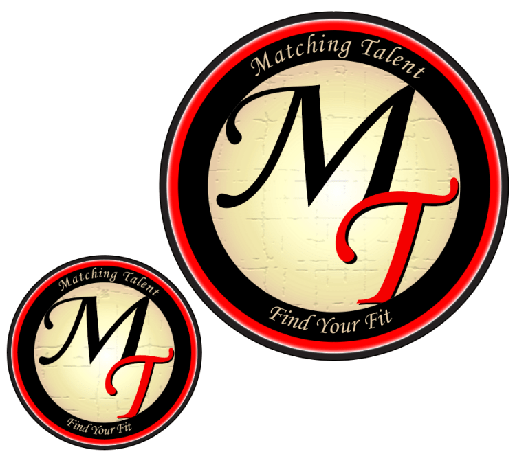
Original Logo
Reflecting on the projects we completed this term, I decided I wanted to fine tune this Matching Talent Logo. I looked through each project we had completed, and immediately identified some areas of improvement on this logo.
Although I may never use this logo in the professional world, I do have a personal and professional relationship to the subject that the logo represents. I have spent a lot of time recruiting for companies, advising on techniques to identify good candidate-culture fits, and experimenting with the best ways to showcase a company’s attributes.
Edits
The first thing I changed about this logo was the white drop shadow on the “MT.” After spending some time away from the logo I realized I did not like the effect this gave. Next, I changed the opacity of the black circle to 100% so that it would be more sharp and would blend better with the black “M.” I also changed the opacity of the outer most circle to 95% to make it more pronounced.
The gradient on the cream circle was altered slightly. I experimented with various 3D effects on the cream circle, but decided to use the Craquelure texture instead. The innermost circle now has a Craqueler texture (crack spacing- 65, crack depth- 3 and crack brightness- 9). This texture made the edges of the circle very weathered, so when I used the clipping mask this time I made sure to clip off the edges of the circle so that it would look crisp against the black circle.
The text was also changed. The “MT” in the innermost circle has a fisheye effect to accentuate the spherical perception. The phrases “Matching Talent” and “Find Your Fit” were moved, the arch was altered, and the text color changed to the same cream color of the inner circle.
Potential Applications
If I were to ever use this logo in a professional environment, it would likely be for my own recruiting firm. I could also see the logo being used to represent a Human Resources discussion board.
Revised Logo
I feel that this version is an improvement from the previous logo in that it is more engaging to the viewer. I also prefer the text coloring and placement in this logo. It was really nice to have an opportunity to revisit the work from this course and revise this project.