Research and Design Stage
The First Draft
Through exploring recruiting and Human Resources material over the last few weeks, as it specifically relates to this blog, I wanted to use the ideogram of puzzle pieces. The Draft Logo I initially submitted, which embodies this idea, is below.
I spent hours and hours trying to make this design idea work… sometimes you just need to know when to give up and change directions. Unfortunately giving up is not my forte. So, I spent a lot of time “beating a dead horse” trying to make this one idea work. I also received some helpful feedback from peers regarding this first logo, but it never seemed to look right. Eventually I disliked this version enough I accepted different inspiration.
Research and Redesign
One of the videos we watched in Unit 2 was useful in reinforcing I needed to go a different direction with my logo. After watching Aaron Draplin Takes On a Logo Design Challenge , it solidified that sometimes simple is better. Simple designs can be more universally applied to gear or backdrops.
When I was first contemplating my design, I found myself leaning towards very innate or busy concepts. In my initial design, I tried to stray away from this, but still found myself dissatisfied with the result. Despite my efforts, the logo never felt balanced. Eventually, I had inspiration for something more classic and simple.
Technical Process
The Circles
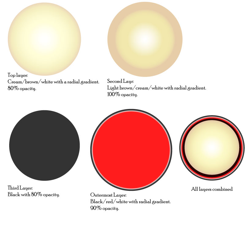
To create my final design, I started with four circles of varying sizes. To the right you can see these circles individually with the color, gradient, opacity and overall appearance chosen for each individual circle listed beneath it. I chose two layers of the cream/brown to create additional depth in the focal point of the design. I selected the colors black, creams and browns as they are neutral and calming colors. I added red because it is a vibrant and complimentary color.
Once the circles were the size, color, gradient and opacity desired, I selected all of them and used the align center tool. The bottom right of the image to the right shows the circles aligned.
The Typography
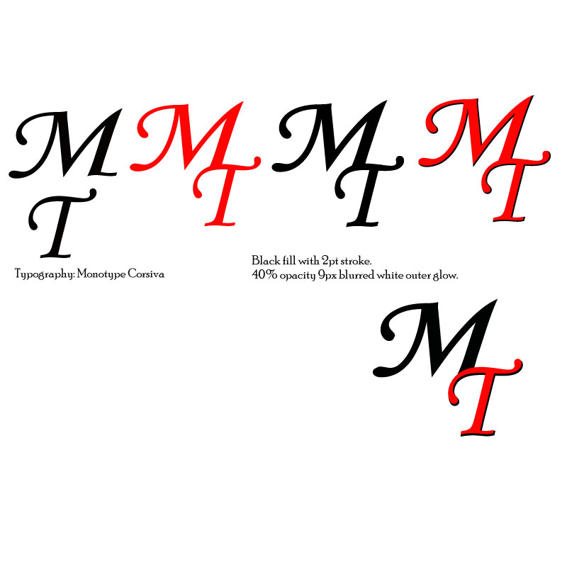
The typography is Monotype Corsiva, which I feel is elegant and professional. To create depth for the “M” and “T,” I used a similar technique as to what we used in the “To-Do Tutorial” to create the check mark and notepad. The first layer of “MT” is all black with a 2pt stroke. For the second layer, the “M” is black and the “T” is red. I aligned these slightly off set to create the black shadow under the “T.” Once the “MT” was aligned and proportioned how desired, I added an outer glow of white at 40% opacity and 9px blurred.
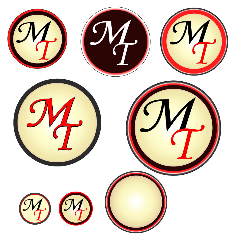
Bringing It Together
With the circles and typography created, next I used the clipping mask. I separated the bottom circle layers (the black layer and red layer), and copied the black layer. The black, cream/white, and cream/brown circles were then aligned with the grouped text. I used the black circle during this stage so I could more easily see what the finished product would look like. Once the text was positioned well, I copied the bottom cream/brown circle, pasted in place and then used the clipping mask. This removed the excess pieces of the letters so they fit better in the circle.
When all circles were recombined and aligned center, the black in the “M” blends into the black circle, utilizing the continuation principle.
Once all of these elements were placed, I grouped them together. Next, I experimented with different variations of words associated to the blog arced at a 45-degree (and –45-degree) angle around the logo. Variations included: “Matching Talent,” “Find Your Fit,” and “Pair People and Places.” This text is also Monotype Corsiva. I selected all groups and used the align center tool to ensure correct placement.
Below you can see several variations of this design:
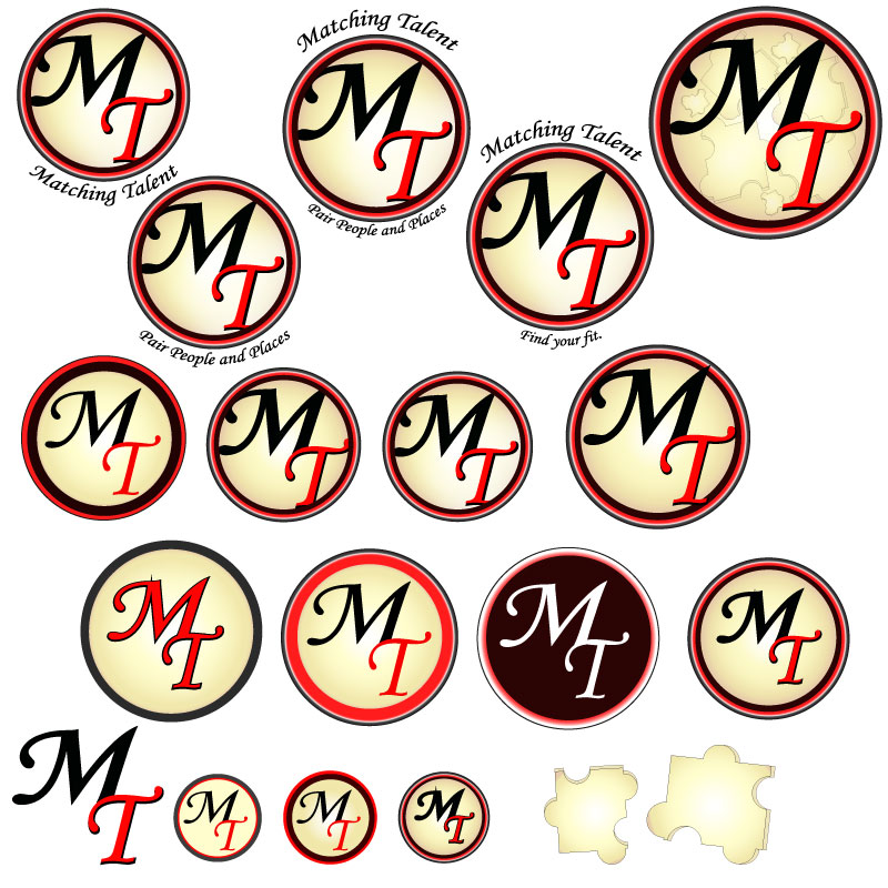
For my final design logo it was challenging to decide between the logo with or without the surrounding words. Depending on branding usage, the words may or may not be included… Eventually I selected the logo with the phrases surrounding the outermost circle, as pictured to the left.
Design Significance
This design ended in a much different place than I had originally anticipated. However, I’m satisfied with the direction it took. The shapes are crisp and simple with pleasing color contrast. The colors are neutral and inviting. To me, there is a 50’s feel to the logo which communicates a level of old-fashioned trust to the audience. Overall, this logo is much more professional and versatile than my initial draft.
