The Research Stage
Through exploring recruiting and Human Resources material over the last few weeks, as it specifically relates to this blog, I chose to use the ideogram of puzzle pieces. In the past I have seen some recruiting memes and articles use puzzle pieces to reference recruiting efforts and found it effective.
An example of this can be found here. The article Manufacturing Companies and HR Tech has a picture that somewhat embodies my thought process behind incorporating the puzzle pieces into my design. This article also discusses exactly what my blog is targeted to discuss: how the HR profession needs to grow along with the technology age.
One of the videos we watched recently was also useful in my research process. When I was first contemplating my design, I found myself leaning towards very innate or busy concepts. After watching Aaron Draplin Takes On a Logo Design Challenge , it reinforced that sometimes simple is better; simple can be more universally applied to gear or backdrops.
Design Process
The design process for my Logo Draft was certainly iterative. It included a lot of: draw, manipulate, apply in Illustrator, manipulate, evaluate, walk away, reevaluate… REPEAT.
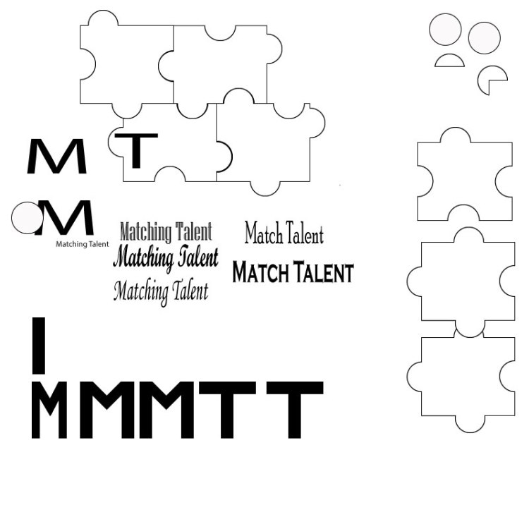
Before beginning in Illustrator, I sketched various ideas. I knew I wanted the logo to have the words “Matching Talent,” with focus on the “M” and “T”, and I knew I wanted to incorporate an ideogram that would support the topic. To the left you can see some of my initial sketches.
Below you see my Logo Draft at several different stages of development.
After a lot of time spent manipulating shapes, letters and colors, I am still not satisfied with the result, but I suppose that is why it is called a draft. I am looking forward to the next step of the user-centered design process and obtaining some feedback that I can hopefully incorporate into my Final Logo.
Stage 2 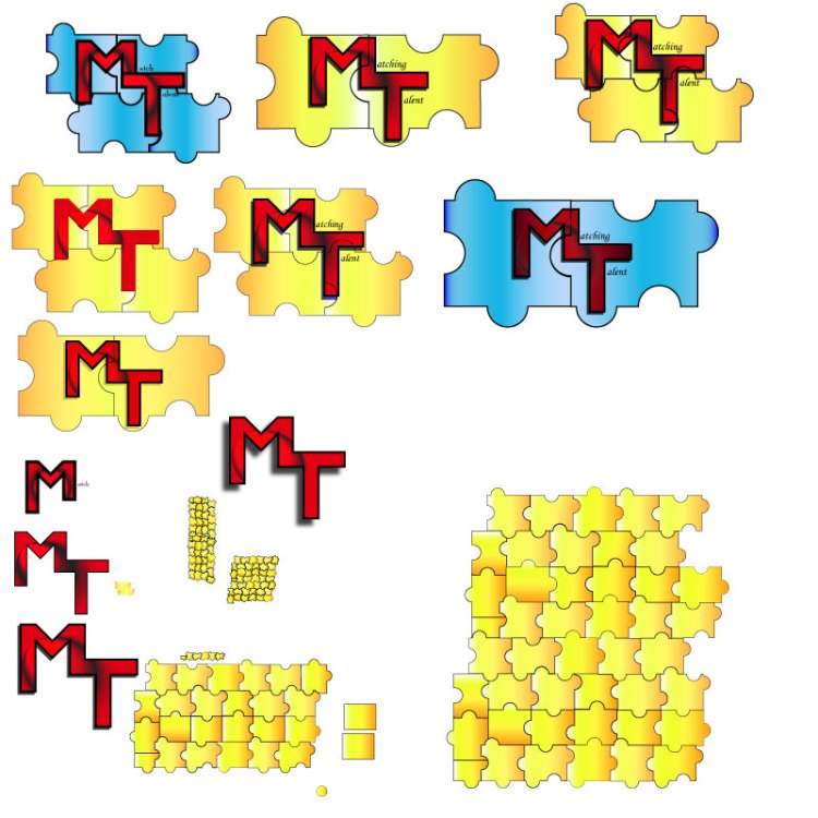
Stage 3 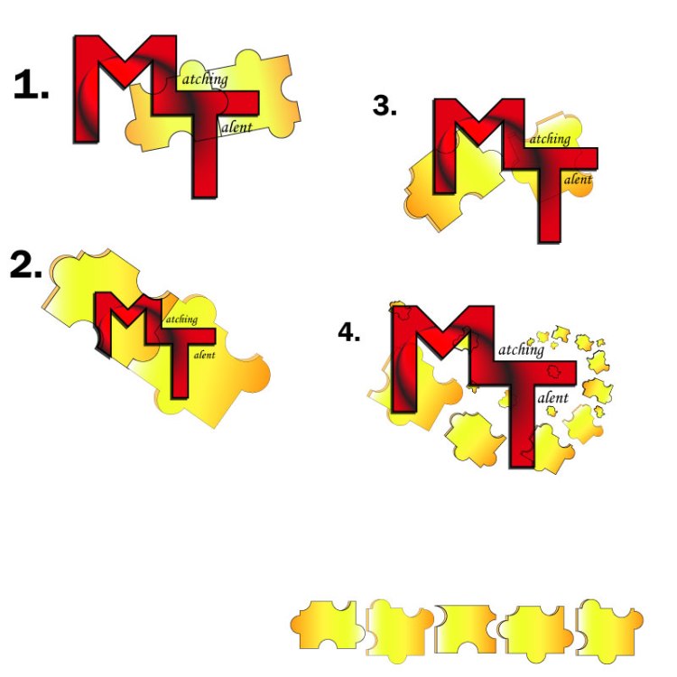
Stage 4
Technical Process
Puzzle Pieces
To create the Logo Draft, I started by creating the puzzle pieces. I used the rectangle tool to create the basic shape, then I used the ellipse tool to create a circle. Once I had both of these base shapes to a size I liked, I duplicated them several times. This provided me plenty of material to experiment with developing puzzle pieces. (See Stage 2 photo)
The shape builder tool ended up being my most used tool for this logo, which is entertaining considering the shape builder tool also gave me the (second) most trouble in the Illustrator Tutorials. Now I am very familiar with it!
To form puzzle pieces, I aligned several rectangles and centered the circles over where the rectangles intersected in an inconsistent, but calculated, way. Then I selected the shapes and used the shape builder tool to merge certain circles with certain rectangles. Keeping the rectangles aligned, this also subtracted half circles from some rectangles, which assisted in creating the variance in shapes.
For these puzzle pieces I used a linear gradient of yellows, oranges, and white. The puzzle pieces have a 0.75 black stroke and are set to an opacity of 100%.
Once the basic puzzle piece was created, I copied the piece, made it a darker orange color with 80% opacity and slightly misaligned it under the original puzzle piece. I then used the shape builder tool to delete excess pieces and merge others to create the 3-D look to the puzzle piece.
The puzzle pieces have been arranged ascending and rotating from the “i” in “Matching,” wrapping the “T” to the “M” in the logo.
Text
Next, I created the letters. I used the rectangle tool to create the “M” and the “T.” In the “Stage 2” photo referenced earlier, you can see the initial rectangle that was used. I copied this rectangle several times and then aligned the rectangles to resemble the shape of an “M” and a “T.” Once aligned, I used the shape builder tool. When completed, I grouped the “M” and the “T” shapes.
I also used the shape builder tool to merge the “M” and “T” into one shape. These adjoined letters use the Gasalt Principle of continuation. For these letters I used a radial gradient of black and red with a –25-degree angle. This, along with some other manipulation, created the black “circular swoosh” through the red letters. The “M” and “T” have a 2pt stroke with a drop shadow of multiply (at 75% opacity, -2 X offset and +2 Y offset with 0 blur). The drafts shown in the “Stage 3” photo have a black drop shadow, but I also experimented with blues and greens for this.
For the text “atching” and “alent” I used Monotype Corsiva font. Simple seemed best for this text.
Design Significance
I wanted to focus on the initials “MT” since this is the title of the blog and represents significance to the recruiting topic. I considered omitting the entire words “Matching Talent,” however, an afterthought was that “MT” also is an abbreviation for the state Montana, so it seemed best to us the entire words.
Red is known as an empowering color. I chose this as the predominant color intentionally, as to, hopefully, empower people to find the right fit. Yellow is a complementary color to red and also joyful, which I feel brightens the logo a bit.
I decided to incorporate puzzle pieces into the design because they are a simple touch that help to further convey the idea of matching or pairing.
Second Draft
The day after we submitted our drafts, I finally got some different inspiration. To the left is another logo draft I started working on. I won’t go into technical details at this time, but I like it because it is much more simple than my other draft with the puzzle pieces. I’m looking forward to hearing your thoughts.
Let’s Continue the Design Process…
I am looking forward to your feedback!

Hi Rachelle,
You most certainly used all the tools in the toolkit to create your logo, and I really think you created a great design! Your technique for creating the puzzle pieces and the way you explained it in your blog is so professional and in-depth! You took designing a logo to the next level! I appreciate the drafts you shared and your entire design process. As a result of your technical knowledge and skill in illustrator, which clearly shows, your logo draft is a great product! I particularly like all the creative work you put into it, the color, the shape, the sizing you utilize to create a 3D effect! It certainly works!
As per constructive criticism, I would advise very little things. The font you use for the letter’s “M” and “T” is great, although it doesn’t quite seem to match (at least in my particular opinion) the font you used for the rest of the word. Maybe this was your design goal, in which case, it’s of course, just a suggestion.
The other thing would be to make the rest of the words bigger, not as big but to match more the size of the M and the T. Maybe a few points bigger, so that the sentence “Matching Talent” feels more aligned, space wide, to the rest of the design.
Other than these two small suggestions, I think your design is great! Good job!
Sergio
LikeLike
Hi Sergio! It’s nice to see you in this class as well! My first impression of your design is just how ambitious it is. I think the swirling puzzle pieces are really fun – it must have taken quite a while to craft them. I also like the color gradient you have going on in the big letters – this definitely adds visual interest and helps draw the eye directly to the center of the image. One thing you may not have intended though – because the eye follows the black swirl into the puzzle pieces, it kind of resembles a heart shape!
I have a couple of suggestions, though they are only my opinion. Right now, I feel that all of the puzzle pieces are kind of getting jumbled together visually. Making the stroke a little thicker might help them stand out more so the viewer can really see that they are all separate pieces. You might even want to use fewer puzzle pieces – perhaps just one or two are enough to get your point across. Right now, I think this logo would be a little hard to duplicate on merchandise or letterhead because of how tiny some of the pieces get.
I’m also not entirely digging the font choice. You have the big “M” and “T,” but I’m not sure a cursive scrawl is the right contrast for the words. Maybe it’s because it’s a mix of sans serif and serif fonts? I’d suggest sticking with a sans serif font like you’re using with the “M” and “T” to help keep the typography a little more uniform.
I also love the simplicity of your second design, so I’m excited to see where you end up going with this!
LikeLiked by 1 person
Wait a second, you’re not Sergio! 😦 Sorry for the name mixup, I skipped my morning tea.
LikeLiked by 1 person
Thank you all for the feedback!
The draft feedback to myself was essentially to start over. I did really like the idea of utilizing puzzle pieces in my design, however the execution did not yield my desired end result. The design felt busy, cluttered, and kind of “cheap;” it never felt balanced; it didn’t convey the message and feel I wanted.
Despite how many hours I poured into it trying to make it work, I eventually came to the realization and decision I was never going to be satisfied with it. Therefore, I started over. I had been pondering this design throughout the week and trying to find something that I would like more. Inspiration actually came to me in a dream on Friday night! This resulted in the secondary drafts which were compiled and posted on Saturday. This draft has a bit of a 50’s feel, which I like much more than the logo making me think of Montana, not that there is anything wrong with Montana.
Sometimes it is important to know when to scrap an idea, and move on….
For the second draft, the design feedback I have for myself is as follows:
1. I would like to make the cream/brown have more depth. I intend to change this through using the gradient tool and adding an additional circle of darker brown beneath it (similar to what we did in the To-Do List Tutorial).
2. I want to create better flow in the lettering as well. I am considering creating additional depth with an outer glow or add additional layers of letters to create depth.
3. I am also considering enlarging the letters and then cutting off the edges using a layer mask, similar to what we did at the end of the To-Do List Tutorial. The intent here is to utilize the Continuation Principle with the letters and the outer rings.
4. I am also considering using the text “Matching Talent”, “Pair People Personality with Company Culture” or “Find Your Fit” in an arc around the outer most portion of the logo.
-Rachelle Berrigan
LikeLike