Matching Talent
Pairing People Personalities and Company Cultures
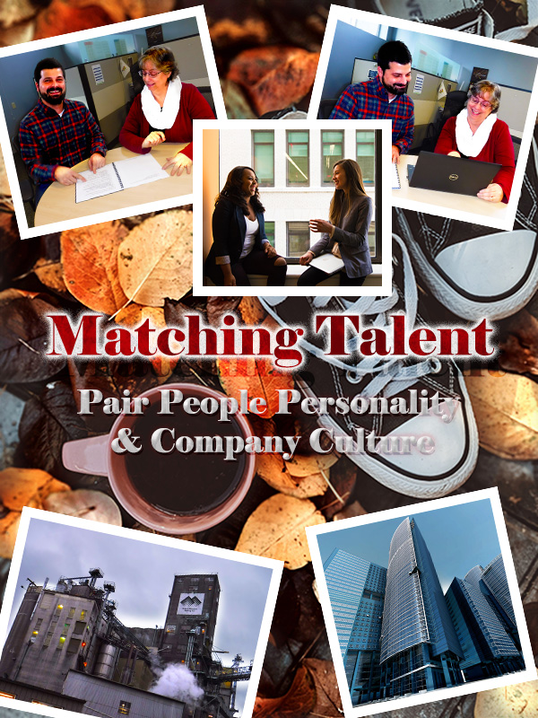
Below is my Graphic Design Draft for COM561. Continue reading to uncover the design process for this draft, learn how it was inspired and the significance I find in the imagery. Significance can be subjective in this case, so your feedback is welcomed! Thanks in advance for your constructive criticism!
All images used in this graphic that are not originally mine are noted throughout this blog and cited below. All images were obtained appropriately according to copyright law.
The Design Process
During the design process, I scrapped several drafts. The nice part about this trial and error was that it forced me to get much more comfortable with some of the Adobe Photoshop elements we reviewed during the class tutorials. I toyed with levels, adding strokes of various thickness, 3D text and experimented with vibrance/color balance/hue/saturation within the “black and white cookie.” It is so easy to lose hours in Photoshop!
The First Layer

For the version you see above, I found the backdrop layer photo from Pexels free images. I chose this photo because I think the Converse are a nice ideogram to “pairing people” to companies. The coffee cup made me think of indulging in caffeine in the work break room. The fall leaves I thought were a nice color contrast to the people pictures I had chosen, along with facilitating the idea of change. This layer was cropped, and I added a nondestructive adjustment layer to the leaves.
People and Places Pictures
Each picture was edited individually. Below you can see some of the original pictures prior to edits. Some of the images I used I changed the contrast through adding nondestructive adjustment layers, such as we did in the cougar cubs’ tutorial. Other images I just brightened or cropped before embedding them into the graphic. Once added to the graphic, each image was resized via free transform and given a stroke border of 11px to frame it. All angled images are angled at 12 degrees. The center image and text are angled at 0 degrees. Having consistency in the stroke border and the angles was done to create some symmetry and similarity in the design.

I attempted to arrange the pictures in a balanced way. I took into consideration the Rule of Thirds as outlined in our reading and attempted to place the pictures of people and buildings near the intersecting quadrant lines. Since the subject matter revolves around PEOPLE and PLACES it made sense to draw focus to these subjects. The placement of the pictures also frames the title and supporting phrase.
Playing with Text
The text I altered and played with a lot. Eventually I settled on the following effects. The words “Matching Talent” have a 70% pattern overlay (trees) to slightly blend the wording with the leaves in the background layer; this text also has an outer glow with a 65% drop shadow effect. The words “Pairing People Personality & Company Culture” have an inner shadow effect, a touch of drop shadow and a slight outer glow. The outer glow is the same color red as the words “Matching Talent.”
I wanted the title and phrasing to “pop” without distracting too much attention from the photos. This is part of the reason why I chose red and white for the text colors, as these colors are reoccurring in the background (leaves and Converse) as well as in the people pictures (model’s clothing). Hopefully some simplicity of the composition was reached here while bringing additional similarity to the imagery.
Design Interpretation
Each element of this graphic was selected with the intent of relating to this blog’s topic. Matching Talent focuses on exploring recruitment methods to match the right personalities to the right company cultures, hence Pairing People & Cultures.
The First Layer
The pair of Converse shoes in the background are supposed to be a play on words. Attempting to pair people and companies just as you might have a matching pair of tennis shoes: they fit so well together they are a MATCH. You wouldn’t wear a Converse on one foot and a Romeo on the other foot, would you?
The People Pictures
Two of these photos are of my co-workers. I asked politely for their permission to photograph them for this project. These photos as well as the photo from Pexel, to me depict people who fit into a company’s culture well. They seem to be comfortable in their environment and enjoying the interactions with their peers. Pairing people to companies is not just about the talent match for the company; it is finding the right fit that suits a candidate’s desires and needs. To me, this tone seems displayed in these photos.
The Buildings

This is a differently edited version then what I used in the graphic. This version I felt was too busy and might distract from the rest of the graphic. Even so, I love the sky in the background- it makes me think of Disneyland’s Tower of Terror.
The building on the lower left-hand corner of this graphic is a picture of one of my company’s manufacturing plants. This building is almost one hundred years old, made out of cement, and probably in need of some “R&R.” To have a contrast of industry, structure and working environment, I selected the skyscraper picture (featured on the bottom right hand corner of the graphic). I wanted to show two different extremes relating to work environments: scenario one might be considered more “blue collar” while picture two might be considered more “executive.” The idea being that every person has a different preferred working environment.
Time for Some Feedback
I look forward to receiving some great critiques of this Graphic Design Draft and hope to put as much feedback into effect as possible!
Image Citations
Creator Name Unknown. “Glass Building in Worm’s Eye Photography.” Pexels. 07 January 2020. https://www.pexels.com/photo/architecture-blue-sky-buildings-business-290275/
Miller, Valeriia. “High Angle Photo of Converse All Start Sneakers Near Cup of Coffee.” Pexels. 29 October 2019. https://www.pexels.com/photo/high-angle-photo-of-converse-all-star-sneakers-near-cup-of-coffee-3146180/
Morillo, Christina. “Woman in Gray Formal Coat Sitting Near Black Full-glass Panel Window.” 22 June 2019. https://www.pexels.com/photo/woman-in-gray-formal-coat-sitting-near-black-full-glass-panel-window-1181562/
ShonEjai. “Closeup Photo of Brown Brick Wall” 10 July 2018. https://www.pexels.com/photo/closeup-photo-of-brown-brick-wall-1227511/

Hi Rachelle,
The presentation of your blog post is organized and well put together because you included screenshots of your design process and thoroughly explained your strategies. On your graphic design project draft, I like how you included two different work environments to show diversity and the colors you chose because warm tones are welcoming. Overall, your draft looks great and visually communicates your topic of how recruiters are like matchmakers, because they try to find the perfect candidate and help them find a job that they will love. Here are some areas for improvement. “Copyright” and “images” are spelt wrong under the caption of your design project draft image. I would suggest adding a new photo of another pair of people since you have two photos of the same people already. Lastly, I think the text “Matching Talent” should be in all caps to emphasize your message, and then the words “Pairing People Personality & Company Culture” should be in a different color or a bolder font because the word “culture” blends in a little with the top part of the Converse shoes.
Best,
Joanna
LikeLiked by 1 person
Hi Rachelle,
Overall your graphic design tells a clear story, Rachelle. The pictures show people working together (‘paired together’) along with the two very different company headquarters pictured at the bottom, to demonstrate your topic is universal.
Area of strength in your design:
• Your eyes are automatically drawn to the red text: ‘Matching Talent’ – which is where you wanted your focal point to be. It pulls the red from the top 2 pictures and blends nicely with the orange background. Combined with the outer glow on the words “Pairing People Personality and Company Culture”, unity is created in your design.
Critical suggestions for improvement:
• The text “Pair People Personality and Company Culture” can be a shade or two darker to distinguish more from the tennis shoes
• Because your topic relates to all working environments, I think adding a picture of peers working in a more industrial background would capture the idea versus having the same peers in two pictures.
It was a pleasure getting to meet you Rachelle!
Cyndi
LikeLiked by 1 person
Good morning –
I think this looks great and I enjoyed reading your thinking behind each decision. You had a well-thought plan and you executed it well. I love your background photo — the fall leaves, shoes, and coffee convey (I think) a sense of comfort. Fall leaves and their contrasting colors add a lot of appeal to your project design.
I also thought it was great you got your coworkers to participate. I didn’t even think of that, but knowing my coworkers, they would have demanded to see the finished product and I would have spent all day listening to what they would do differently (they are all professional marketing specialists). 🙂
The one thing I think I would do differently is the color of the text. Seems like it blends a little with the background images/colors. Maybe experiment with some different colors to see what really stands out but still goes with the color palette you’re using.
I look forward to seeing your final product!
LikeLiked by 1 person
Hi Rachelle, thanks for posting this draft. I appreciate that you used real people in your posting, it makes it appear more authentic than using stock images. For me, the background is a little chaotic. I suggest using a simple background photo, or creating an adjustment layer to wash the color out a bit. I like the shadow effect you have around the headline “Matching Talent” but the text underneath blends into the background image a bit. Also, I wasn’t completely sure what the project was promoting. Is it a meeting, or event? If so, I would add a date. Or is it a poster? Overall, looks good and makes me want to use some of those text effects myself.
LikeLike
Self-Feedback
After submitting my design draft, I had a few ideas to improve the design. Several of my group members commented on similar improvement areas, so I started experimenting with variations of my draft. Two critical areas of improvement I identified are: (1) the text visibility and contrast to the rest of the draft and (2) the proximity of the photos.
The text “Matching Talent” could be altered to make more of a statement without being too bright or distracting from the rest of the imagery. I like the idea Joanna had to make the text all capitalized. I think I will also change the outer glow on this text to a lower opacity with a different spread and range. This will hopefully create more depth to the text with a softer transition. As for the text “Pair People Personality & Company Culture,” I agree that the letters blend into the Converse in an unclear and distracting way, which several critiques noted. I think I will change the font color here and also reposition all of the text. The outer glow of this text will also be changed to a more complimentary color rather than the same color as the text “Matching Talent.” I am also considering changing the text to “Pair Personality & Company Culture.” Finding the right combinations here will take some experimenting.
As for the photo arrangement, this could use improvement as well. I agree with my peers’ reviews that the photos could be more balanced. Although I like both of the photos I took of my coworkers, I think it would be more balanced to only use two people photos and two workplace photos. When rearranging these I could better use the Proximity Principle by having the people and workplace photos closer together; by “pairing” the people photos with a workplace. Overall, I think altering the proximity of the photos will better communicate my message.
Thank you all for the feedback!
-Rachelle Berrigan
LikeLike