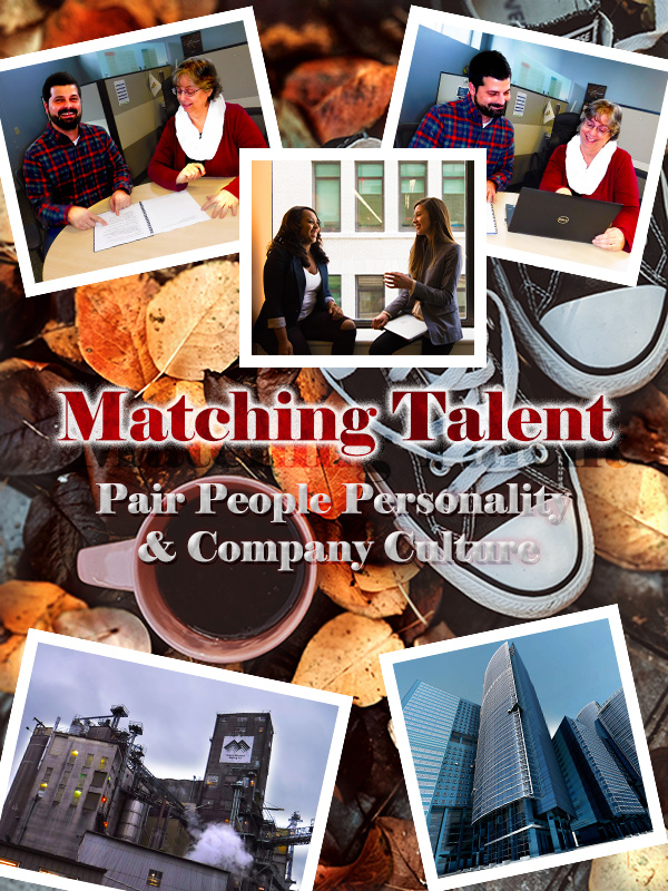
Final Graphic Design Project

Matching Talent:
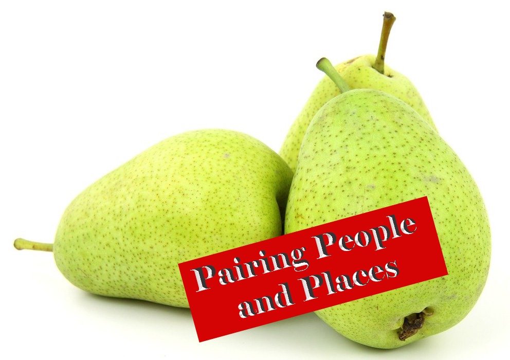
Pair People Personality and Company Culture

In this post I will take you through the creation of my Final Graphic Design Project for COM561. I will explain the user-centered design process and will discuss the inspiration and imagery significance within this flyer advertisement.

Design Process

This is the draft that was submitted for initial review.

During the design process, I scrapped several drafts.  The nice part about this trial and error was that it created an opportunity to become more familiar with Adobe Photoshop along with effects we reviewed during the class tutorials.   I experimented with levels, adding strokes of various thickness, 3D text and manipulated vibrance/ color balance/ hue/ saturation within the “black and white cookie.” When I encountered a design challenge, I would either refer back to our class tutorials, search for other available tutorials or simply explore options in Adobe until I found something that looked right.

The First Layer
If the shoe fits….

I found the background layer photo from Pexels free images.  This photo was selected because the Converse are a nice ideogram to “pairing people” to companies.  The coffee cup made me think of indulging in an afternoon “pick me up” in the workplace. The fall leaves I thought were a nice color contrast to the people pictures I had chosen, along with facilitating the idea of change (such as a change in career).
This layer was cropped, and I added a nondestructive adjustment layer to the leaves.

People and Places Pictures

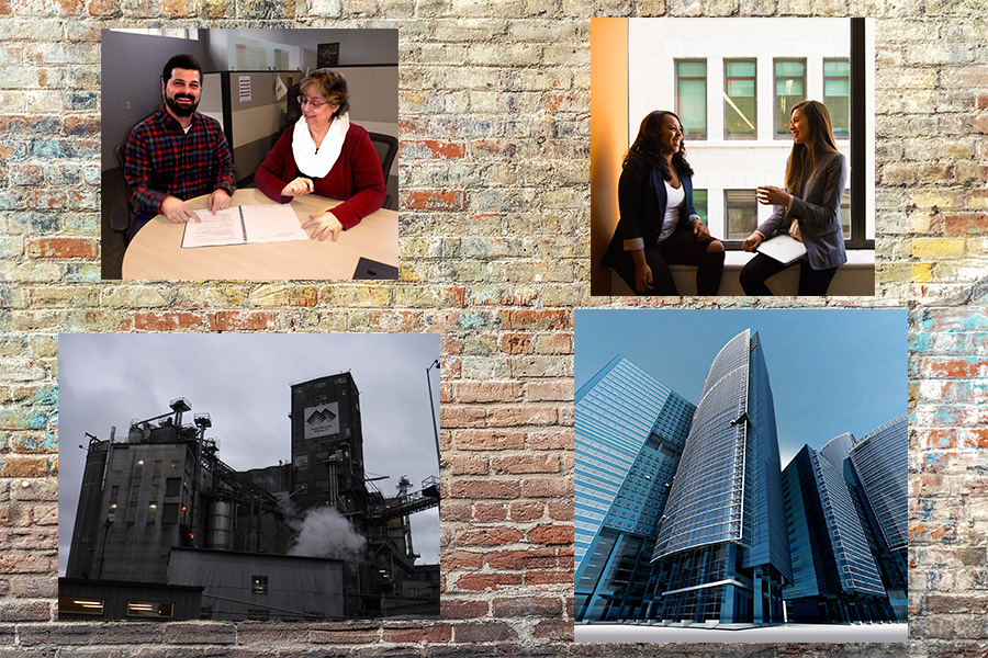
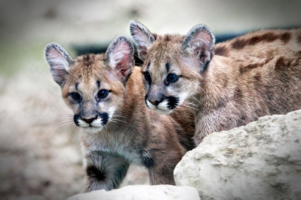
Below you can see the original raw photos.  For some of the images the contrast was changed through adding nondestructive adjustment layers, such as we did in the cougar cubs’ tutorial.  Other images were brightened or cropped before embedding them into the graphic. 

Once added, each image was resized via free transform and given a stroke border of 11px to frame it.  During the revision phase, the stroke border was changed to 85% opacity to create slight transparency and provide transition from the background layer.  All images are angled at 12 degrees or -12 degrees.  Having consistency in the stroke border and the angles was done to create symmetry and similarity in the design. 

Here you can see some of the original pictures, prior to being doctored.

To create better balance and order in the final design, I removed one of the people pictures and rearranged the photos so that each vertical half of the graphic has one people photo and one workplace photo.  Through this edit, I still considered the Rule of Thirds and attempted to leverage it, while placing the photos in a way as to frame the title. 

Playing with Text

The text was altered A LOT.  After the peer reviews, I made even more revisions.  I changed the positioning of the title to be more centered vertically and moved the phrase to fill what was previously empty space. 

I implemented the advice to capitalize all letters in “Matching Talent.”  The text color remains the same.  The leaf pattern overlay is now 49% opacity, and the outer glow was changed to create a somewhat dimmed white underlay to the title.  The outer glow opacity was changed to 73% with 20% noise; the Elements technique is now “Softer,” and the spread is 15% with a size of 35%.  This is how the faded white banner behind “Matching Talent” was created.  The outer glow was changed this way in attempt to create additional depth and soften the text while still keeping it a focal point.

The phrase “Pair People Personality & Company Culture” was changed a few ways.  The font style and size were edited, and the color is now an orange with a Bevel & Emboss shading of brown and red at 100% opacity paired with a gloss contour.  This along with the leaf texture (35% scale and –22% depth) and a 44% opacity yellow overlay drop shadow give an illusion of fall leaves within the text without becoming invisible to the background. 

To further separate this text from the background layer, I added a complimentary blue outer glow.  The opacity for this is 85% with a “Softer” Elements technique and a spread of 35% with a size of 20%.  This helps the text “pop” without being overwhelming to the rest of the design. I also like this effect because it looks like the phrasing could be floating in a water puddle among the leaves.

With these changes I think there is better balance and similarity to the imagery. 

Design Interpretation

Each element of this graphic was selected with the intent of relating to this blog’s topic.  Matching Talent focuses on exploring recruitment methods to match the right personalities to the right company cultures, hence Pairing People & Cultures.    

The First Layer

The pair of Converse shoes are a play on words. Attempting to pair people and companies just as you might have a matching pair of tennis shoes: they fit so well together they are a MATCH. You wouldn’t wear a Converse on one foot and a Romeo on the other foot, would you?  

The People Pictures

One of these photos is of my co-workers; they were gracious enough to let me photograph them for this project. This photo and the photo from Pexel, to me depict people who fit into a company’s culture well.  They seem to be comfortable in their environment and are enjoying the interactions with their peers. 

Pairing people to companies is not just about the talent match for the company; it is finding the right fit that suits a candidate’s desires and needs. To me, this tone is displayed in these photos. 

The Buildings
This is a differently edited version then what I used in the graphic advertisement. This version I felt was too busy and might distract from the rest of the graphic. Even so, I love the sky in the background- it makes me think of Disneyland’s Tower of Terror. 

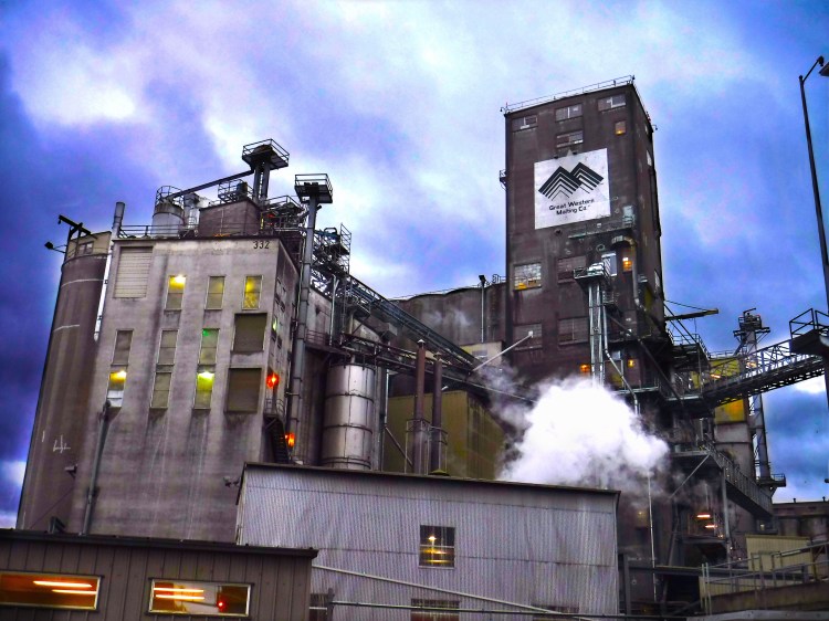
The building on the lower left-hand corner of this graphic is a picture of my company’s malt manufacturing plant.  This building is almost one hundred years old, made out of cement, and probably in need of some “R&R.”  To have a contrast of industry, structure and working environment, I selected the skyscraper picture (featured in the upper left- hand corner of the final graphic). I wanted to show two different extremes relating to work environments: scenario one might be considered more “blue collar” while picture two might be considered more “executive.” The idea being that every person has a different preferred working environment.

Final Review

With no further adieu… here is the final version of my Graphic Design Project:

Matching Talent:
A blog to explore how to Pair People Personality & Company Culture. What is the right fit for you?

Image Citations
Creator Name Unknown.  “Glass Building in Worm’s Eye Photography.”  Pexels.  07 January 2020.  https://www.pexels.com/photo/architecture-blue-sky-buildings-business-290275/
Miller, Valeriia. “High Angle Photo of Converse All Start Sneakers Near Cup of Coffee.”  Pexels.  29 October 2019.  https://www.pexels.com/photo/high-angle-photo-of-converse-all-star-sneakers-near-cup-of-coffee-3146180/
Morillo, Christina.  “Woman in Gray Formal Coat Sitting Near Black Full-glass Panel Window.”  22 June 2019.  https://www.pexels.com/photo/woman-in-gray-formal-coat-sitting-near-black-full-glass-panel-window-1181562/
ShonEjai.  “Closeup Photo of Brown Brick Wall”  10 July 2018.  https://www.pexels.com/photo/closeup-photo-of-brown-brick-wall-1227511/

Graphic Design Draft

Matching Talent
Pairing People Personalities and Company Cultures

Below is my Graphic Design Draft for COM561. Continue reading to uncover the design process for this draft, learn how it was inspired and the significance I find in the imagery. Significance can be subjective in this case, so your feedback is welcomed! Thanks in advance for your constructive criticism!

All images used in this graphic that are not originally mine are noted throughout this blog and cited below. All images were obtained appropriately according to copyright law.

The Design Process

During the design process, I scrapped several drafts.  The nice part about this trial and error was that it forced me to get much more comfortable with some of the Adobe Photoshop elements we reviewed during the class tutorials.   I toyed with levels, adding strokes of various thickness, 3D text and experimented with vibrance/color balance/hue/saturation within the “black and white cookie.”  It is so easy to lose hours in Photoshop! 

The First Layer
If the shoe fits…

For the version you see above, I found the backdrop layer photo from Pexels free images.  I chose this photo because I think the Converse are a nice ideogram to “pairing people” to companies.  The coffee cup made me think of indulging in caffeine in the work break room.  The fall leaves I thought were a nice color contrast to the people pictures I had chosen, along with facilitating the idea of change. This layer was cropped, and I added a nondestructive adjustment layer to the leaves.

People and Places Pictures

Each picture was edited individually. Below you can see some of the original pictures prior to edits.  Some of the images I used I changed the contrast through adding nondestructive adjustment layers, such as we did in the cougar cubs’ tutorial.  Other images I just brightened or cropped before embedding them into the graphic.  Once added to the graphic, each image was resized via free transform and given a stroke border of 11px to frame it.  All angled images are angled at 12 degrees.  The center image and text are angled at 0 degrees.  Having consistency in the stroke border and the angles was done to create some symmetry and similarity in the design.

Here you can see some of the original pictures, prior to being doctored.

I attempted to arrange the pictures in a balanced way.  I took into consideration the Rule of Thirds as outlined in our reading and attempted to place the pictures of people and buildings near the intersecting quadrant lines.  Since the subject matter revolves around PEOPLE and PLACES it made sense to draw focus to these subjects. The placement of the pictures also frames the title and supporting phrase.   

Playing with Text

The text I altered and played with a lot.  Eventually I settled on the following effects.  The words “Matching Talent” have a 70% pattern overlay (trees) to slightly blend the wording with the leaves in the background layer; this text also has an outer glow with a 65% drop shadow effect.  The words “Pairing People Personality & Company Culture” have an inner shadow effect, a touch of drop shadow and a slight outer glow.  The outer glow is the same color red as the words “Matching Talent.” 
I wanted the title and phrasing to “pop” without distracting too much attention from the photos. This is part of the reason why I chose red and white for the text colors, as these colors are reoccurring in the background (leaves and Converse) as well as in the people pictures (model’s clothing).  Hopefully some simplicity of the composition was reached here while bringing additional similarity to the imagery. 

Design Interpretation

Each element of this graphic was selected with the intent of relating to this blog’s topic.  Matching Talent focuses on exploring recruitment methods to match the right personalities to the right company cultures, hence Pairing People & Cultures.   

The First Layer

The pair of Converse shoes in the background are supposed to be a play on words. Attempting to pair people and companies just as you might have a matching pair of tennis shoes: they fit so well together they are a MATCH. You wouldn’t wear a Converse on one foot and a Romeo on the other foot, would you?

The People Pictures

Two of these photos are of my co-workers.  I asked politely for their permission to photograph them for this project.  These photos as well as the photo from Pexel, to me depict people who fit into a company’s culture well.  They seem to be comfortable in their environment and enjoying the interactions with their peers.  Pairing people to companies is not just about the talent match for the company; it is finding the right fit that suits a candidate’s desires and needs. To me, this tone seems displayed in these photos.

The Buildings
Malt Manufacturing Plant
This is a differently edited version then what I used in the graphic. This version I felt was too busy and might distract from the rest of the graphic. Even so, I love the sky in the background- it makes me think of Disneyland’s Tower of Terror.

The building on the lower left-hand corner of this graphic is a picture of one of my company’s manufacturing plants.  This building is almost one hundred years old, made out of cement, and probably in need of some “R&R.”  To have a contrast of industry, structure and working environment, I selected the skyscraper picture (featured on the bottom right hand corner of the graphic). I wanted to show two different extremes relating to work environments: scenario one might be considered more “blue collar” while picture two might be considered more “executive.” The idea being that every person has a different preferred working environment.

Time for Some Feedback

I look forward to receiving some great critiques of this Graphic Design Draft and hope to put as much feedback into effect as possible! 


Image Citations
Creator Name Unknown.  “Glass Building in Worm’s Eye Photography.”  Pexels.  07 January 2020.  https://www.pexels.com/photo/architecture-blue-sky-buildings-business-290275/
Miller, Valeriia. “High Angle Photo of Converse All Start Sneakers Near Cup of Coffee.”  Pexels.  29 October 2019.  https://www.pexels.com/photo/high-angle-photo-of-converse-all-star-sneakers-near-cup-of-coffee-3146180/
Morillo, Christina.  “Woman in Gray Formal Coat Sitting Near Black Full-glass Panel Window.”  22 June 2019.  https://www.pexels.com/photo/woman-in-gray-formal-coat-sitting-near-black-full-glass-panel-window-1181562/
ShonEjai.  “Closeup Photo of Brown Brick Wall”  10 July 2018.  https://www.pexels.com/photo/closeup-photo-of-brown-brick-wall-1227511/


Pairing People and Places

What is Matching Talent?

Matching Talent is an opportunity to discuss and explore recruiting.  More specifically, this blog focuses on discussing recruiting methods, recruitment advertising practices, and approaches to recruiting the right candidate-career fit.  Similarly to how the technology age has impacted our daily communications with one another, it has also impacted recruitment methods.  Recruiting is another profession attempting to keep up with the changing times! 

I chose to create this recruiting communications blog because I have both personal and professional intrigue regarding how technology is changing recruitment tactics.  I also enjoy theorizing on most successful recruiting practices, applying these theories and seeing what yields positive results.  In my current profession I have identified recruitment process improvement opportunities which I look forward to exploring through this blog.  

Why Recruiting Communications?

Beer brings people together...
Cheers!

In my current position, I manage all recruitment activities for two of my company’s three North American business units.  Being in the malt manufacturing industry, the business and community are incomparable to other industries.  The people are passionate, genuine, propelled by creativity and connected through the product.  Beer brings people together.  However, being an age-old delicacy can impact the technological progression of the industry. 

Malting has been a practice for hundreds of years. Since the tradition has been industrialized, not much has changed to the process fundamentally.  An ancient practice can sometimes bring with it outdated business methods.  In this case, recruiting methods have opportunity for improvement through alignment with the technological age.  To review a brief history of the malting process, click here.

Changing the Approach to Recruiting

Today people have the capability to learn all about a company before they even interview.  Online customer reviews and employee comments are accessible with just a few words typed into a search engine.  Job seekers utilize these online resources to decide which company applications to complete. 

With these changes, employers need to have a different approach to recruiting.  In today’s market, there is a lot of discussion about employees desiring more than just a pay check.  They want work life balance, a good company culture, development opportunities, solid benefits, flex time, personable managers and so much more that can’t adequately be described in a job posting.   

So…

If company culture and employee personality can’t be adequately represented in a job posting, how do we communicate these vital aspects of our company to candidates?  How do we entice the right candidate to apply?  How do we pair talented people with the right company cultures?

That is what we are here to explore…. 

PublicDomainPictures17912. Untitled. Pixabay. 13 December 2010 https://pixabay.com/photos/food-fresh-fruit-green-isolated-2280/

Design a site like this with WordPress.com
Get started